Friday, June 09, 2006

The Last Structured Comment

Who am I kidding, this post is going to hav nothing to do with structure. and yet to be strictly judgemental, I am using a template that someone else designed, and I am typing with a font, that we now know to have been designed by somebody else and I am using the computer and internet and blah blah blah. If this were a word document, I would have to capitalized the word internet to Internet becuaseit has the force of god and america and America and god. What I am getting at is that everything is a design element and everything is a decision. I do worship the internet, because I am afraid of meeting people and am ultimately afraid of people judging my design elements in person. No, no no you need feedback and not just on a discussion board or in a comment section of blogger. You need to be able to see peoples body language when adressing your work, and how people crane their necks and position their legs and point their fingers.

I live in a digital age, you live in a digital age, and we live in a digital age, but we need to embrace the technology, while still questioning and exploring with hands on themes and techniques. I do not want to stutter or not be able to spell check my writing, however accidents and personality and speech and drawn line are what sets humans apart from animals. Not opposable thumbs or the act of looking good in a bathing suit.

I would never use a computer again if I could get away with that. I have beautiful handwriting skill, I have an above average memory and my capabilities with 3-dimensional shapes and geometric forms rival that of a computer. But the precise record of being able to save exactly what a form looks like50 or 100 years from now is what sets me and the computer apart. But we all take for granted that computers will be able to save files for 50 or 100 years, because this has never been established, only the idea has.

I want to keep my ideas in my head, where if I lose them, only I can find them. The cycles of my brain can be trusted, just as the memory of a memory can be trusted. as for now, I have to hit the save button and use the reproduction option by burning a copy of this blog for my teacher. Which file is the strongest, and most clear, the file, the document, the disk, the thought I am having right now, or the hand off of ideas that may have come form reading this?

This One is Introverted


This summer, the big movis of the supposed "blockbuster" events center around movies I have yet to hear about. Although, in my last post I did swear off t.v. but I do enjoy watching strange movies and foreign/independent films. I might still have to hide my 27 inch television in my large expansive closet.

Anyway, last week I did watch a television show that talked about the animated movies coming out this summer. There were too many to mention, and I believe every major and non-major studio was participating. This is fair because of america being a capitalist society and everyone has the right to present. However, due to the enormous influx of digitally animated films, the art is lost and the political message and celebrity voices are coming back with a vengeance. I have only seen toy story and the incredibles to date. And their probably have ben 30 or so digitally animated movies since toy story hit with such a craze. I am not saying that digitally animated films are bad, I am just wondering where the experimental and cell animated films have gone? As an art student, I have seen Luxo Jr. and other early computer based animation, and those people work extremely hard and there is an art to it. I am just upset that one has to spend a lot of time searching on line for outlets of animated films that are not highly advertised on t.v. Some might say that this is good because they are not seeling out, however people these days are so lazy that going out of your way to find a film is troublesome; and I hate to fit in with the times of being lazy and spending money on entertainment that forces you to sit and be lazy, and hopefully you're mind is excercising.

So enough already, every time I gripe about something it usually menas that I wish I were doing it so I should finish these last two posts and go draw on film and create narratives on canvas, but I do not want to copy anybody, do I?

Digital Television


Little did I know, television can now be output as digital. To me, I still do not know anything further on the matter concerning how digital television works. I do have slim experience in I once watched hi-definition television, and one time I even went to a house that had a tivo. But I do not know if those use digital connections, but I do know that calling it the tube, might not correlate anymore.

The Latin Trade magazine had an article in their sept. 2005 edition, entitled ''Image Makers: Brazil could chart its own course in age of Digital TV." The key points for me in this article were the numbers they through out in accordance with government investment towrds television outlets. The story quoted that Brazil was to invest the equivalent of 26 million dollars just to see which television style is better. The story also was quoted as saying that the industry of digital televison in America, was in the billions as far as marketing and research were concerned.

Bottom line, as someone who wishes to remain fairly imaginative and original, I should quit the television light from hitting my eye for good. Even if you watch educational tv or only sports, the mind altering ads and subliminal messages will get you.

Tuesday, June 06, 2006

I am not finished Yet


In talking about Norman McLaren. I began to notice that most art forms and technologies come from past techniques. I was curious if anybody had any ideas on hand drawn or sculpture techniques, where past influences played a role? Of course, past techniques influence new style, but the graphite pencil is still the graphite pencil with a wood casing. Clay pottery has employed a wheel and even a motorized wheel, but these transformations do not directly come from one person's dedication to their craft, such as in McLaren's case. I am not proclaiming that his style and ideas fed to the invention of digital animation, however if you view some of his films, you can definitely see the resemblance of technique.

I have become more and more fed up with digital animation. Especially with the mainstream studios. I have only viewed a few of these new animated films (ever since toy story) because I usually spend the first part of the movie trying to figure out what famous actor they have doing the voice over. That does seem like a petty reason not to see a film, but the animated films these days that are shown in movie theatres try to hard to wow with 500 million bit color and politiacl/social influences.

Again, the more I gripe the more I begin to understand that things change and people get tired of the same aesthetic. Because of this I will not sit on the couch and watch the next pointless movie that my roommate puts on. And maybe I will begin to lose all of the celebrity gossip that was enstilled in me at such a young age by watching television in the first place. TV should only be for fear and gross entertainment, like every show these days that portrays a murderer or child molestor or terrorist. Ripped from the headlines. I am 6 foot 2 inches and afraid to leave my house.

Experimental Mention


The more I tried to review new software and digital art techniques, the more I reminisced on the old techniques. I am feeling more and more that in order to learn something new one should look to the past for inspiration. This goes against most of my points in my past blogs, but nobody is perfect. Not to steal their ideas, but to use them as a starting point to appreciate the advantages we have in the year 2006.

The experimental film creator, Norman McLaren comes to mind when I think of animated movies and how computers mimiced his style for their advantages in creating animated film. McLaren lived from 1914 to 1987, so he did get a chance to see and probably used computers for something, just not to wow audiences with realistic pixel work. McLaren used experimental techniques such as drawing on film to create images and scratching and all kinds of intersting marks were created which then were projected onto a screen. He also used techniques like filming the motion of people and then backing up the film and recording again along with stop motion animation. He also created sound cards that had black and white lines on the cards. The cards that had thin lines produced high pitch sound, and the cards with thick lines produced low pitch sounds.

To connect to my above comment on looking to past work for inspiration, that was meant more as an appreciation to those who did not live in a digital age and had to explore and make their own technology in order to create what they wanted. I am also curious about film and digital animation, because, as someone who studies art at a university; more and more students are entering the digital arts programs. Is this due to money, jobs, and it being the new trend. Or does the attraction of easier publishing and sharing over the internet have an effect on this uptrend of digital art students. I will keep exploring the possiblities of digital designs, but you can always catch me with a pen and a piece of paper, thinking of my next idea.

Monday, June 05, 2006

The Run On


The act of reproducing artwork from the past is not a new concept and does not solely pertain to the album cover artwork of the band, Franz Ferdinand. Although when I did some searching as to the type of band and where they come from, Franz Ferdinand are from Scotland and they used the name from archduke Franz Ferdinand of Austria. The same Archduke who was assassinated in 1914 in Sarajavo. This event is a crucial point in the World War of I.

I am not blaming the band, Franz Ferdinand for stealing other people's names and poster art, but is reproducing other's artistic work beneficial to a band. Aparently in the case of this band it is working, although I would suspect that their young following is not yet versed in the history of the world.

As for me, I see the act of reproducing others creative work as unorigianl and will not attempt the stunt, no matter how much I envy the creation. I should use the example of music artist's who sample music from classic songs. Those recordings always sell more records than the originals anyway. So instead of finishing this blog entry, I am going to snoop the web for elbows and background colors of rembrandt paintings, while I attempt to create something that will get me attention, any attention. You may find me at your local gallery, with scissors and checkbook in hand. Anybody feel like sharing their work with me?


Here Comes A Treasure Hunt


The act of reproduction is fantastic, you see something you like and in todays tech-modern world all you have to do is download it and it is yours; or is it. If I could jam the thousands of legal pages concerning ownership and copyright material, I just might. The moment had come when I drawing near to dispizing the digital age. This is certainly not the most crucial or viable example, but it does tie into the "art" of reproduction. Here is the picture in question. . .
(well I have not perfected placing pics yet). View above image.

This image is a photograph taken by Alexander Rodchenko in 1925 and turned into a poster entitled, "books.'' This was just after a revolution in Russia and poster art was a main form of media meant to show the Russian youth that they could overcome adversity and better their country.

Then, in 2005, the band Franz Ferdinand used the photograph Rodchenko took of Lilya Brik for their album cover you could have it so much better. I was discouraged at this reroduction, because the cover of the album did not copy the entire Rodchenko poster; but did look enough like it to change the meanng for me. This album cover now sits in every cd and record store for all to view; yet you have to do some serious searching to find the original poster, and to get to the bottom of its original meaning.

I can see how reproducing old works of art gives new life to the piece and lets a new generation take part in its design, however in the case of the album cover, the entire use and political meaning of the art is lost. Having said my thoughts on the ease of digital reproduction, I did use the poster, which I downloaded off the internet in order to make my point. Does this make me a hippocrit, or am I potentially spreading a well designed poster for people in other circles to see, or does it not matter because the modern world is so littered with imagery that it is virtually impossible to create an origianl image that is not some way or another created from your unconscious remembrance of an image?

On that note, here are 3 more examples of Rodchenko rip offs. One, the 80's band The Ex used the same image as Ferdinand for one of their album covers as well. Two, Ferdinand also swiped a Rodchenko poster for another album cover Take Me Out. The previous image looks very similar to the poster in this gallery of works by
Rodchenko. Please take note of the copyright information in the box below several of the pictures and make sure to click on the correction links for the wikipedia posting on this very information. Wikipedia lets anyone on the internet post information and not all posts are entirely accurate.

Sunday, June 04, 2006

Keep Thinking


Changing gears to new technolgy, the magazine wired , had a brief article last month entitled "Scribble Me This," by Todd Jatras. Of course when I went to the site I searched for ten minutes trying to find the article to link to; which I ultimately could not find. This did however lead me to other interesting articles on new technologies that are making their way to the market.

Before I get too side tracked though, the article by Jatras was concerning the design collective front and "using motion-capture technology, not using sensor-studded suits but similarly trackable pens. A 10-camera array records gestures, which are then output digitally to a laser sintering machine." This laser then cuts shapes made out of liquid plastic which match the computer files. The designers are then able to create molded plastic chairs and proto-types for experimental design. The picture in the article also showed a lamp that was modeled off of a fly flying around the room and using the digital record in order to use the laser to create an experimental shape from the fly's path.

This process frees the graphic designer from building 3-D models by hand. Now the designer can draw out an idea on the computer and use the sae file in order to build a plasic model with the laser cutter. I have never used this invention/program, but I have drawn a picture on paper, scanned the image and sent the file to owosso graphics. This company does photoengravings. They cut a magnesium plate of the image I sent them, and I used it on a printing press to aid the text I had set. Thier are definite benefits to laser cutting, but carving wood and etching copper are still the best ways in my eyes.

Today is the Day


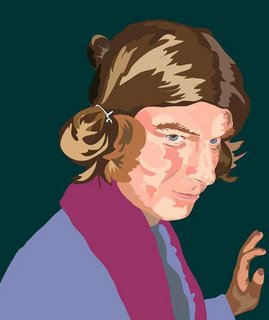
Here I am, plastering my physical presence on the web. I spent hours using my new maybeline products, and hours tracing my face to copy it for Illustrator. This was my first time ever using Illustrator. I took the picture on the left and then traced layers and added color to the image on the right. Now I can almost be thrown into a digital movie. I have a question for the reader's, "Should I continue to live as human or should I bite the bullet and perform the entire surgery?" I always wanted to be an image running through make believe land.

Now on the issue of cloning, it cost a lot of money to regenerate my cells, but it was certainly worth every penny. I apologize for not including a hand drawn portrait of me in this get up, unfortunately I do not appear like this any longer. I trimmed the hair to be taken seriously by society. Although now that I run through the wacky land of compressed layers and endless bandwidth, I should learn how to create a program that alters my image with the click of a button.

All joking aside, this technology is helpful and lets the creator create complex ideas in a shorter fashion. This is not exhibited in my two portraits, but if I wanted to add transparent layers or change clothes, it would extremely faster to change the opacity of the Illustrator layers, than go in and draw transparent layers. I still am not going to trace my photos to achieve better likenesses of myself when drawing by hand though. The freedom of the hand and drawing media establish more expression and life, than vektor dots stacked upon each other. It would be interesting to put pixels versus pointilism and see the effects of the two approaches. I can visualize the difference, but I won't truly know until I do it.


Saturday, June 03, 2006

Online Magazine


On all of my entries, I was typing in the edit html section. Apparently my IQ is below the 100 level. But, I feel so happy. Maybe ignorance is bliss.

Today the issue of online magazines is on the agenda. This topic is great because you do not have to be afraid of conglomerate publishing houses noticing you to get published on the web. You have the freedom of starting your own web page/online periodical. Or you can submit your work to online magazines. One such web based magazine is Vektorika vektorjunkie. This website allows users to submit their vektor based art to the site; the only catch is that they cannot put everyone's piece in the magazine. So their still is some elitism in the process, but you won't know what happens until you try.

This system frees the creators mind to new oultets for artist's to show their work. As for me, I might start littering the world of colorful pieces of paper that have my woodcuts and pencil drawings on them. My only catch would have to be that smehow I incorporate a digital video showcasing my pleasant carnage to the world. I keep writing angrily about digital media, I suppose that stems from the ease of ideas that flow through it. However when I objectively stand back, I notice that it takes an art and patience to write code for programs just as it takes time and an art to carve a piece of wood, or to formulate ideas.

Friday, June 02, 2006

Pick a Typeface, Any Typeface


I prefer my own handwriting, partially because I will be able to be a scribe and produce beautiful calligraphy; that is of course when the entire civilzation has horrible handwriting because schools and business force everything to be typed, due to legibility. Guess what, who out there did not know that someone creates, and our designs the typefaces we use on our taken for granted computer screens. Just as someone spends hundreds of hours writing code so that our computers can function, someone out there is spending hundreds of hours creating type. This process started around the time of the first printing press, hundreds of years ago. Then the form transfered to typewriters, and now to computers. The process and art is so far diluded, that I doubt people even give a thought to the process of what makes a type face or "font."

We can use this to begin to think about what happens, "A geometric sans wouldn't have been legible enough at very small sizes and on bad paper, and a serif was not acceptable for cultural reasons. So I gave the letters little pseudo-serifs, which also opened the potential ink-traps between down strokes and curves. These little swerves guide the eye along the top of the x-height, where most differentiation occurs." And what he forgot to mention is to mind your "p's" and "Q's" but that only applies when you are hand setting type for a printing press. This is a brief thought on how Erik Speikermann designed the META TYPEFace for the German Post Office in 1985. This came from an article in grafik magazine.

All I want poeple to get from this post is that not everything is either times roman or stencil when chosing how to communicate with "written" words. And that new technology such as the computer, and photoshop, and illustrator, all perform tasks that can be accomplished by human beings with only the click of their hand.

Again, Think


Here comes the thought process again. Could be in any form of thought, whether you are looking down on a landscape frrom the top of a hill. Or losing all the liquid in your eyes because of a bright white computer screen. The thought process in the article I read by I believe was Tobias O. Rink from Novum magazine comes in the form of style and perceiving what style is. This is a tricky judgement because right now I have the luxury of typing on an iMac G5, but when i go home i type on a pc. I desperately wish to enter a lab of white walls with white apple computers and me, wearing white gloves, white rimmed glasses and huge sticky white tongue from eating too many powdered donuts. Then I would be able to clearly express what style is and what it isn't.

In the article entitled, "A Question of Styles," Rink states that "Preserve memories of the past, we will see many things in a different light and continue to shape our style." That quote seems to be mis-quoted, ut oh the effects of reproduction are coming forth. Whithout blogger having spell check i caun spiell words in any fashun and no wun can tell me to stop . Getting back to the quote of style being preserved in memories and shaping our future. Right now the hip thing is to create new ideas and use new technology, but to have pictures of retro 80's and 70's style taking over. If I was only born five years later, I would be a whiz at adding pictures of this phenomena. Who am I kidding though, right now I am wearing a pinkish gey shirt, with orange and brown plaided pants. Although, I am pulling it off and I will one day create a flash animation of me changing from my day job clothes, into the creator of ideas outfit.

The function of style changes when it hits the mass media and computer display screens, keep in mind that my outfit of pink and orange will be seen differently on tv, a pc or a mac, and will definitely be a different color on an ink jet printer. For now, my mind has all the ram and storage I need, that is until "they" upgrade the human brain to download images.

More Philosophy


My latest thoughts have concerned what can be done with digital tools, not in the creative process, but in theorizing and showcasing work. This lead me to find a brief article in Communication Arts magazine, concerning facilitating the licensing of images.

This topic is one of those that hits you in a common sense manner. I am aware that people who create images have specific rights to those images, but where is the line and how sturdy is it? This website www.useplus.com appears to have worked out some sort of system via the internet to help designers license their work.

The philosophy aspect of this task is now that digital reproduction (such as digital cameras, scanners, and storing photos that can be taken off of websites) is available to anyone with a free library card, how safe are images you put out to the public. As my digital imaging professor mentioned last week, starting out as an artist, you should be more worried about having an avenue for the public to see your work, than worry about people stealing your images. For those who are already established artist's, I presume that they have legal backing, or have insider knowledge in the subject.

Is this to say, that only the master painters and photographers who lived before the digital era will be exempt from stealing and manipulation of their images. What about public domain and when your copyright wears off. Well, I did here that anything anyone creates in the present day has an official copyright, without even applying for anything.

Thursday, June 01, 2006

Hopefully Ideas are Enough

I have no ideas how to make the title stand out form the text below. I tried adding links like the help options stated, and when I tried to change the links options to something relevant and away from google news, the links took me to the starting page for helping me to edit my links.

I need to employ an editor and someone who can wisk my ideas to be multimedia friendly. Alteast I know how to log on to my account in order to gripe.

The topics of digtial versus hand made is still very strong in my mind, if only I could finish these blog entries and begin my own digital or hand made creations.

This entry is based around the idea of taking your design firm global and adding your marketing team and research departments to go to places like India and China in order to spread design. This is all coming from Christopher Liechty who is featured in an article in the "How Design" magazine, where he talks about running design companies and spreading his ideas globally into 25 different languages. If I was not already heated over the lack of my skill in dealing with html and adding links to websties that I would never even go to; then this article put me over the edge. And by the way, what ever happened to hugging people when you greet them.

I can feel that I am taking an ignorant and perhaps young-minded stance, but do countries of third world nations really need americanized add campaigns and swank digital design in order to push commodoties and services. And why do businesses always feel that going global is the best thing to do for society. I know that I would be better read and more creative if it weren't for television and snazzy ads and design campaigns that triggered my sexual urges and growth as a loving person. And besides, no matter what designers from the west design for foreign countries, the finished product will corrupt what makes this exotic and foreign country unique, and ultimately worth traveling to. If people in the design world say that there is a demand in third world countries, for hip and trend setting style, then maybe we should just digitally manipulate brochures and wreck the landscape of foreign countries in order just to say, "We've been there." If you do not like my tone or agree that I am being selfish and childish in my antics, then I declare that you should sit down with me and eat some paste that is non-toxic and conforms to the astd rating of eternal tasty goodness.

Visual Experiments


Today I will note the importance of accepting an idea and a movement. Most designers are striving to create original pieces of art that evoke emotion and response. You can then take it a step further and discuss the rationalism of selling your ideas to collectors, or to companies to promote advertisement.

Stumbling through the art library at my university campus, I spotted the magazine entitled, Novum. All the text was written in german, and then came the articles. Which fortunately for me were written in both english and german. The art of Reza Abedini caught my eye . He was using typography and static images of people to create visual speeches of (since I cannot read Farsi) human struggle and why you do not have to feel that way. The author of the article was stating that Reza was an up and coming designer out of Iran who took it upon himself to alter and thus create his own calligraphic style of farsi.

These posters were made of silk screen prints and the image was very strong with little no background besides a color tone. The foreground was emotion driven with words written over the people, sometimes forming the appendages and middle sections. My mind started to wander and relate the importance of digital media in spreading the ideas of people from all over the world together and how that could not have been accomplished as easily before the invention of the all great and ever knowing internet.

Strangely, over the two page spread of this article, I began to respect the power and freedom the internet can give people of all nationalities and class distinctions.